Paula Martinho · Digital Designer
Freelance Project — In partnership with Copywriter/Creative Strategist
Visual ID design and creative strategy for Orfeão Caldense
Client
Orfeão Caldense
Tools
Figma · Adobe Suite · Kit · Carrd
Work by
CARE Creative Studio (Design Agency)
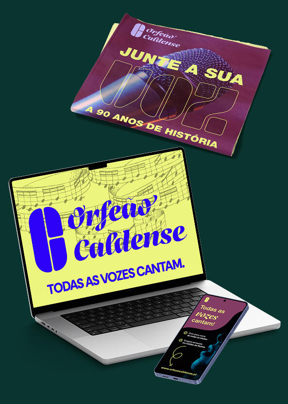
My role: Designer, responsible for the visual identity design, social media imagery and development of the choir's presentation website.Responsibility: Creation of street posters, Facebook ad campaigns, imagery for social profiles (Facebook and Instagram), and a dedicated landing page with information about the choir and a sign-up form.
Challenge
How might we redesign the visual system of Orfeão Caldense, preserving the symbolic heritage of 90 years of choral activity, while ensuring legibility, versatility and immediate recognition across posters, social profiles and the local press?
Solution
Development of an elegant, functional visual identity system, built on script typography that balances tradition and modernity.The solution:
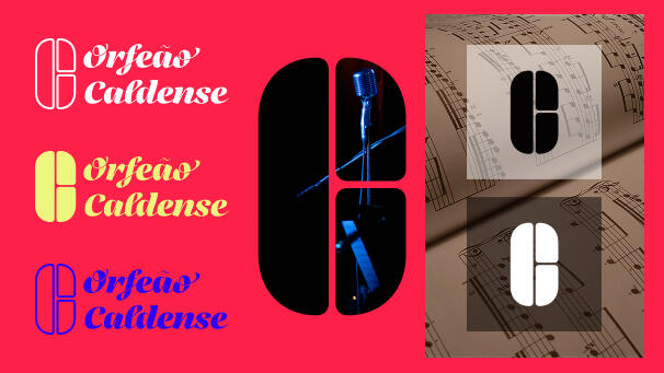
- Introduces a modular logo, with a monochromatic version, adaptable to colour and image backgrounds;
- Makes the brand icon self-contained, making it easier to apply on social media and small-scale graphic materials;
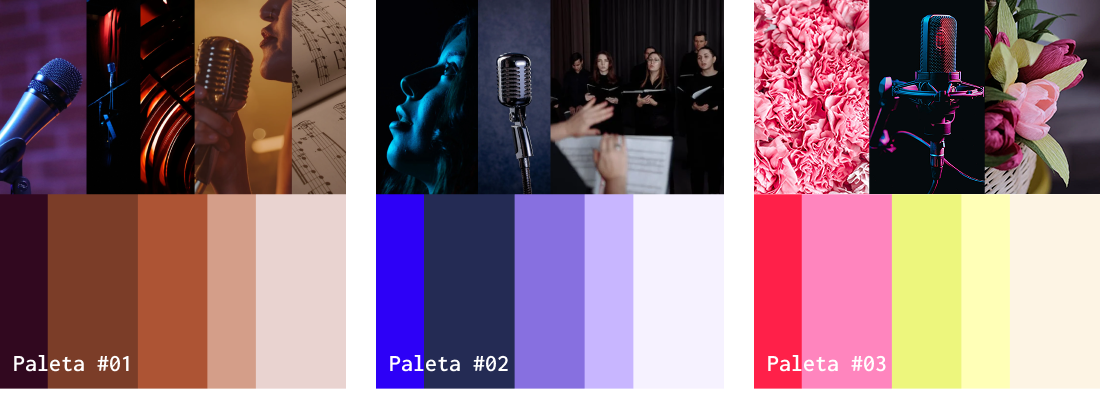
- Proposes a colour palette designed to speak to different generations of audiences.
Key outcomes
1. Scalable identity system
Logo and icon applicable across digital and print formats.2. Audience-driven colour strategy
Definition of colour palettes, each tied to a distinct emotional reading, to support communication according to the target audience of each initiative.3. Coherent narrative
Construction of the anchor message "Junte a sua voz" ("Add your voice"), articulating tone of voice and content architecture across the campaign materials (social media and posters).
Approach
The project began with an audit of the existing visual identity and digital presence, which identified concrete legibility limitations and the absence of a graphic system.Building on this diagnosis, the development of the visual identity unfolded in articulation with the definition of the verbal identity (message, tone of voice and content architecture), built in partnership with a copywriter/creative strategist.Main tasks
- Proposal of a new visual identity to ensure application, scalability and coherence across multiple channels and formats;
- Logo design;
- Colour palette proposals;
- Contribution to the definition of tone of voice and narratives (written and visual);
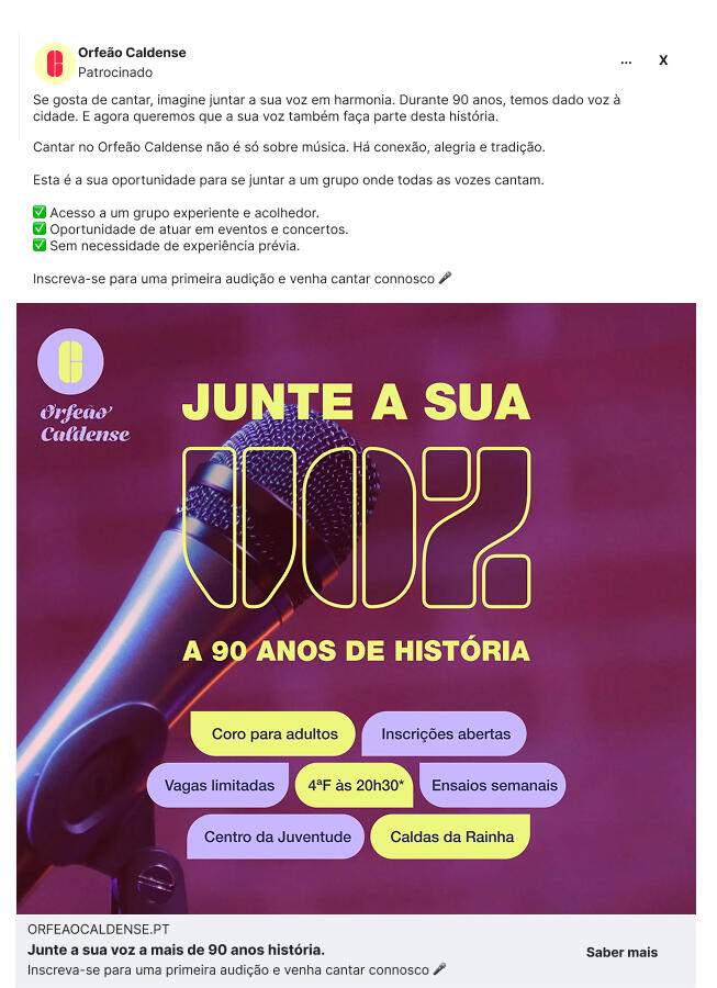
- Creation of a Facebook advertising campaign;
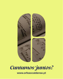
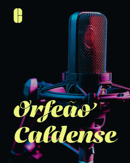
- Creation of imagery for social profiles (Facebook and Instagram);
- Information architecture and development of a presentation website for the choir with a sign-up form.
Audit
Diagnosing the brand and its digital presence
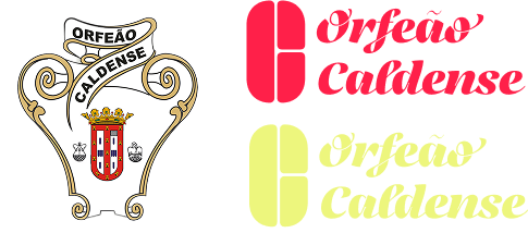
The starting point was an audit of the existing identity and digital presence of the Orfeão, a choir with 90 years of history in Caldas da Rainha.The diagnosis revealed:
- A logo with excessive decorative detail and little versatility across scales;
- Typography that was curved and ornamented, hindering quick reading of the name;
- The absence of a monochromatic version and of a self-contained symbol for social media;
- A historic brand that was not prepared for digital channels.
Before & After
Ideation
Redesigning the visual identity
With the diagnosis complete, we created a proposal for a new identity: modern and adaptable to digital and print formats.Key decisions:
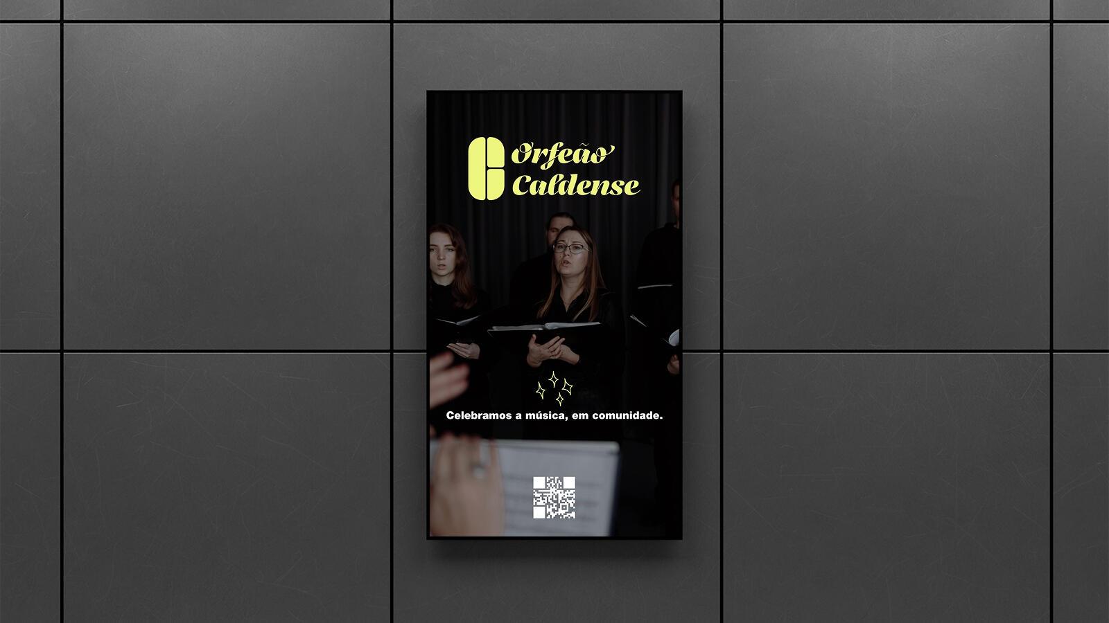
- Script typography that balances tradition and modernity, improving legibility;
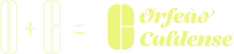
- An abstract symbol built from the initials O and C — figuratively, a stage and two audiences. It can be used on its own;
- A monochromatic version that guarantees application on any background;
- A dual colour scheme: vibrant tones for energy and immediate attention; soft tones for serenity and elegance, depending on the audience and the communication goal.
Visual and written narratives
Building the message
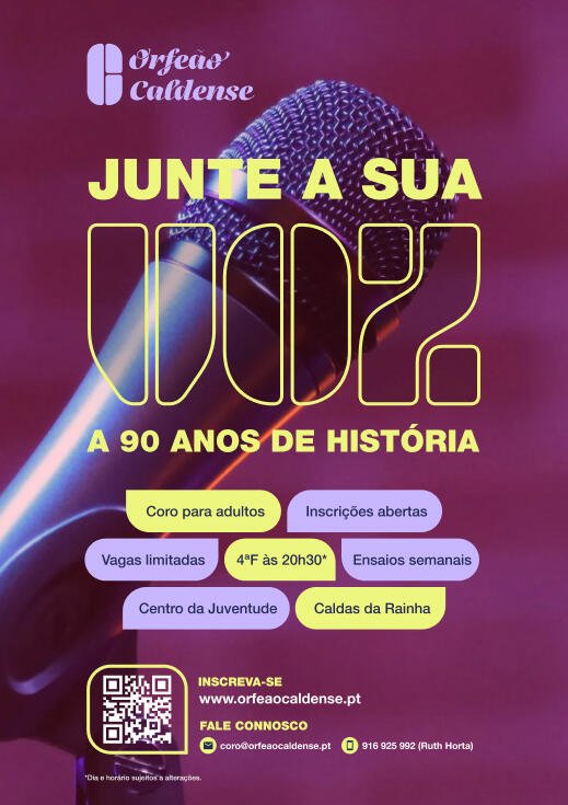
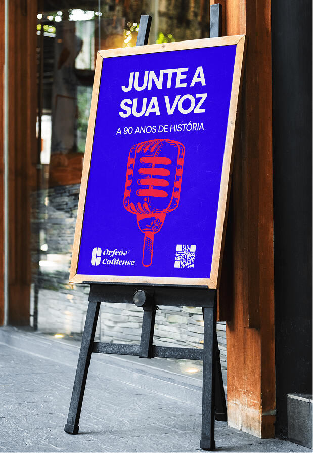
The visual identity was paired with a verbal strategy: "Junte a sua voz a 90 anos de história."
(In English: "Add your voice to 90 years of history.")Every word was a decision:
- "Junte" ("add/join") — an action verb that invites people to become part of the group;
- "Sua" ("your") — a direct, inclusive form of address;
- "Voz" ("voice") — more than singing: expressing what you feel.The message rests on three emotions associated with the Orfeão (connection, joy and tradition) and on three concrete benefits: a welcoming group, participation in events, and no musical experience required to join the choir.The closing line is a no-strings invitation: a first audition.
Campaign
Activating the multichannel campaign
The strategy was designed for three complementary channels, with one shared goal: attracting new members and strengthening the Orfeão's presence in the city.Social media
Introduction and welcome posts, bio copy and content for local events (Tasquinhas 2025), with a direct link to sign-ups.Street posters
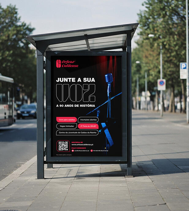
Bus stops and central locations, with a QR code linking the physical medium to the digital one. Smaller versions for shops and cafés.Local press
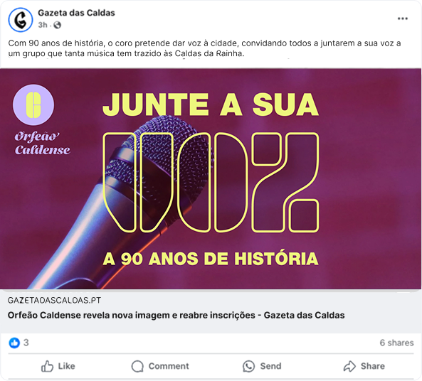
A press release announcing the new image and the opening of sign-ups, with a testimonial from the board president to build credibility.Digital and physical reinforce each other throughout the campaign.
Consolidating and reflecting
A renewed identity and an integrated campaign that position Orfeão Caldense as a brand with 90 years of history and voices open to the future.Critical reflection
This project reinforced the importance of thinking of visual identity as a system: logo, colour, tone of voice and content architecture were developed as parts of a single structure across multiple channels and formats.This project demonstrates my ability to:
- Lead a rebranding process from diagnosis to activation;
- Articulate visual identity and communication strategy into one coherent system;
- Adapt a traditional brand to contemporary audiences and channels.
Other projects
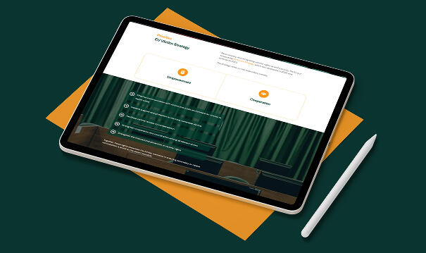
Web Design & Development · European Project
VICTORY Digital Repository
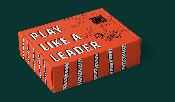
Graphic Design · AI Prototyping · European Project
Designing the LEADCOR game: Analogic & digital experiences
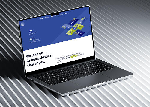
UX/UI Design · Web Design & Development
IPS Website Design Makeover
Work in progress. Expect ongoing refinements. A Portfolio is never done-done © 2026 Paula Martinho